Engineering Better UI Flows: The Modal Dilemma
Turning complex compliance mandates into a seamless frontend user journey
In the fintech world, regulatory compliance is more than just a checkbox, it is the cornerstone of trust and security. As digital payments continue to reshape how businesses transact globally, financial institutions face an increasingly complex web of Anti-Money Laundering (AML) and Know-Your-Customer (KYC) regulations designed to safeguard the financial ecosystem.
At Glomopay, we recently embarked on a journey to implement Third-Party Verification (TPV) for our payment link creation process. What started as a straightforward compliance requirement quickly revealed itself to be a nuanced frontend challenge involving multiple user decision points, validations, and interconnected user interface (UI) flows.
This is the story of how we navigated the complexities of building a TPV system, the challenges we encountered with modal interactions, the research we conducted into various approaches, and ultimately, the pragmatic solution that emerged to deliver a smooth user experience.
The Problem Statement
The Regulatory Backdrop
Financial regulatory authorities worldwide have established strict Anti-Money Laundering (AML) and Know-Your-Customer (KYC) requirements that fundamentally govern how Banking, Financial Services, and Insurance (BFSI) companies operate. At the heart of these regulations lies a simple but critical mandate: all financial transactions must be conducted through verified bank accounts associated with the registered business or individual.
These rules are not arbitrary; they serve critical purposes:
- Transparency: Creating clear audit trails for financial movements.
- Fraud Mitigation: Preventing unauthorized account usage and identity theft.
- Crime Prevention: Blocking money laundering and unlawful financing activities.
For Glomopay, this meant implementing a Third-Party Verification (TPV) service that ensures incoming payments (Pay-Ins) are processed only from or to bank accounts that have been registered and validated for a specific customer, regardless of which merchant they are transacting with.
The Implementation Challenge
Our team was tasked with building the frontend system for this TPV flow within our payment link creation dashboard. The requirements seemed straightforward on paper:
- Display existing bank account details for customers.
- Enable adding new bank accounts with proper data collection.
- Provide validation mechanisms for bank accounts before creating a payment link.
However, there was a catch in the fine print. The system needed to support two distinct validation workflows, each with its own complexity:
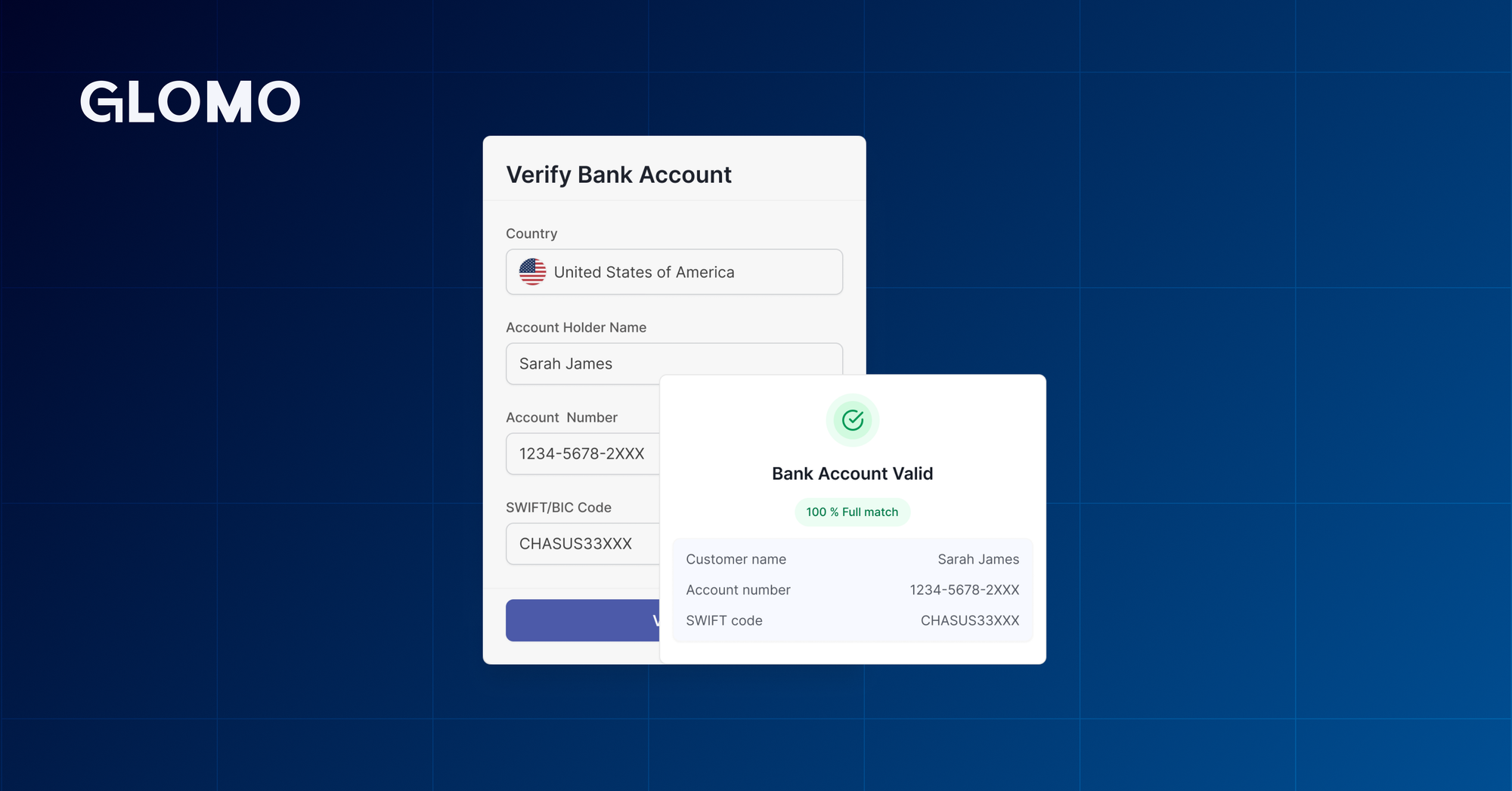
- Workflow 1: Validating Existing Bank Accounts This was the simpler scenario. When a user clicked the validate button for an existing account:
- Open a confirmation modal to acknowledge the action.
- Proceed to display the validation result modal.
- Workflow 2: Validating New Bank Accounts This is where things got interesting. The flow required:
- Data Collection: Open an "Add Bank Account" modal to gather:
- Account number.
- Customer ID associated with the bank.
- Either Bank Identifier Code (BIC) Secondary or BIC Primary code.
- Dual Action Points: From this modal, users could choose:
- Add Bank Account: Save the account details without validation.
- Validate & Add: Verify the account before saving.
- Data Collection: Open an "Add Bank Account" modal to gather:
The requirement was to show a confirmation dialog before performing any action.
The Approaches: From Initial Solution to Refinement
Initial Approach: Leveraging Existing Infrastructure
Before reaching for external libraries or complex patterns, we looked at what we already had. Our codebase included a utility called showConfirmationDialog() - a simple imperative function that displayed a confirmation modal with customizable title, content, and callbacks for confirm, cancel, and close actions. It handled all modal rendering and state internally.
Implementing the Flow
The implementation was straightforward. When a user clicked "Add Bank Account" or "Validate Bank Account" inside the form modal, we would call showConfirmationDialog() with appropriate messaging and callbacks.
For adding without validation, the onConfirm callback would:
- Call the backend API.
- Close the existing
addBankAccountModal. - Display the updated list of bank accounts.
For validation, it would:
- Close the
addBankAccountModal. - Call the validation API.
- Open the
validationResultModal.
This leveraged existing code, required no new dependencies, and followed a simple mental model: button click → confirmation → action → next step.
The Problem: Modal Over Modal
This approach had a serious flaw, one that our designer caught immediately during the demo.
When we called showConfirmationDialog(), it opened the confirmation dialog on top of the addBankAccountModal. Both modals were visible simultaneously, stacked on the screen. Only after the user clicked confirm would both modals close together before moving to the next step.
This overstepped a fundamental UI principle: never stack modals on top of each other.
Back to the Drawing Board
The Fix: Sequential Modal Transitions
The fix was straightforward. Instead of calling showConfirmationDialog() while the Add Bank Account modal was still open, we would:
- First close the existing modal.
- Then show the confirmation dialog.
- If the user clicked cancel, reopen the previous modal in the
onCancelcallback.
Now, it worked, one modal at a time, clean transitions, happy designer.
The Scalability Problem
However, this introduced a new concern: repetitive boilerplate. Every time we needed this pattern, we had to manually:
- Close the current modal.
- Call the confirmation dialog.
- Wire up the
onCancelto reopen the previous modal.
This was tedious, error-prone, and scattered the same logic across multiple places.
Research: The Modal Stack Approach
Our initial idea was ambitious, to create a system generic enough to open any modal from any other modal while maintaining consistent behavior. The mental model that resonated was imagining a stack of modals:
- Opening a modal pushes it onto the stack.
- Closing or canceling pops it off, revealing the previous modal.
- Only the top modal is ever visible.
This approach had several benefits, but after careful examination, we realized we were overengineering. What we actually needed was a simple abstraction for the confirmation-from-modal pattern.
The Final Solution: ModalConfirmButton
How It Works
The solution was a simple React component that encapsulated the entire pattern: ModalConfirmButton. It:
- Closes the parent modal when clicked.
- Shows a confirmation dialog.
- Reopens the parent modal if the user cancels.
- Executes the action if the user confirms.
import React from 'react';
import { Button, ButtonProps } from '@mui/material';
import { PopupState } from 'material-ui-popup-state/hooks';
import useConfirmDialog from '@/hooks/use-confirm-dialog';
import { TShowConfirmDialogPayload } from '@/types/confirm-dialog';

type TConfirmationDialogProps = TShowConfirmDialogPayload & {
  beforeOpen?: () => boolean | Promise<boolean>;
};

type ModalConfirmButtonProps = ButtonProps & {
  confirmationDialogProps: TConfirmationDialogProps;
  sourceModal?: PopupState;
};
- Button that shows a confirmation dialog before executing the action
- If confirmation.beforeOpen is provided and returns false, the dialog won't open
- If sourceModal is provided, it closes that modal before showing confirmation and reopens it when the user cancels the confirmation
export const ModalConfirmButton = ({ confirmationDialogProps, sourceModal, onClick, children, ...buttonProps }: ModalConfirmButtonProps) => {
  const { showConfirmDialog } = useConfirmDialog();
  const handleClick = async (e: React.MouseEvent<HTMLButtonElement>) => {
    onClick?.(e);

    if (confirmationDialogProps.beforeOpen) {
      const result = await confirmationDialogProps.beforeOpen();
      if (!result) {
        return;
      }
    }

    if (sourceModal) {
      sourceModal.close();
    }

    showConfirmDialog({
      title: confirmationDialogProps.title,
      content: confirmationDialogProps.content,
      confirmText: confirmationDialogProps.confirmText ?? 'Confirm',
      cancelText: confirmationDialogProps.cancelText ?? 'Cancel',
      onConfirm: confirmationDialogProps.onConfirm,
      onCancel: () => {
        confirmationDialogProps.onCancel?.();
        if (sourceModal) {
          sourceModal.open();
        }
      },
    });
  };

  return (
    <Button {...buttonProps} onClick={handleClick}>
      {children}
    </Button>
  );
};
Why This Works
- Reusable: Works for any button in any modal.
- Composable:
beforepenallows pre-confirmation validation. - Familiar: Extends Material-UI (MUI) Button, so no new patterns to learn.
- Focused: Solves one problem well.
Learnings: What This Experience Taught Us
- Understand the Problem Before Solving It
- First instinct was to build a generic modal stack system.
- Real issue was simpler: confirmation without stacking.
- Takeaway: Focus your efforts on fulfilling the necessary requirements.
- Start Simple, Then Iterate
- Multiple iterations revealed the actual requirements.
- "Wrong" approaches taught us what was needed.
- Takeaway: Let the problem teach you the solution.
- YAGNI (You Ain’t Gonna Need It)
- Modal stack would have been overkill.
ModalConfirmButtonis ~50 lines and solves the exact problem.- Takeaway: Solve today’s problem today.
- UX Reviews Catch What Code Reviews Miss
- Modal stacking wasn’t a bug, but a user experience issue.
- Designer caught it during the demo.
- Takeaway: Demo to stakeholders early.
- Good Abstractions Are Focused Abstractions
- The component does one thing well.
- Easy to understand, use, and maintain.
- Takeaway: The best abstractions have a narrow, clear purpose.
Conclusion
Our journey from a "simple" TPV requirement to learning about modal patterns and pragmatic decision-making was not linear. We started with an existing utility, encountered UX issues, conducted research, stepped back, and arrived at a focused solution.
"Sometimes, the most sophisticated thing you can do is keep it simple."