Modals 101: When and How to Use Them
Modals are powerful but tricky. Learn when to use them, avoid common mistakes, and design accessible, user-friendly experiences. Perfect for designers and developers!
What is a Modal?
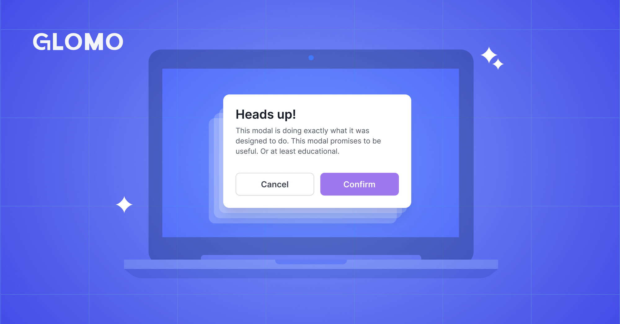
A modal (or modal dialog) is an overlay window that appears on top of the main content, blocking interaction with everything underneath. Think of it as a conversation that demands your full attention, you cannot do anything else until you respond or dismiss it.
Common examples include:
- Confirmation dialogs (e.g., "Are you sure you want to delete this?")
- Login forms that pop up when you try to access protected content.
- Cookie consent banners that require a choice before proceeding.
The key characteristic of modals is that they are interruptive by design. They dim or block the background, trap keyboard focus inside, and force users to deal with them before continuing. This makes them powerful but also easy to misuse.
When to Use Modals (and When Not To)
Appropriate Use Cases
Modals are appropriate for:
- Preventing critical errors: For example, irreversible actions like permanent deletion.
- Requesting essential information: For instance, authentication before saving changes.
- Breaking complex workflows into steps: Simplifying multi-step processes into digestible chunks.
When to Avoid Modals
Avoid using modals for:
- Non-essential content: Newsletters, marketing pop-ups, or feedback requests.
- Decisions requiring blocked content: If users need to reference the background content, a modal is not ideal.
- High-stakes processes: For example, checkout flows, as modals can erode user trust.
- Frequent routine actions: Overuse can lead to "modal fatigue."
- Auto-triggering on page load: Unless it is genuinely critical (e.g., data loss prevention or security alerts).
As UX researcher G. Lucas Roe puts it:
"Arriving on a page is not considered user input. Avoid automatically showing a modal when a user lands on a page."
Essential Accessibility Requirements
Ensuring accessibility is not optional - it is mandated by WCAG 2.1 Level A. Here are the key requirements:
ARIA Attributes
- Use
role="dialog"or the native<dialog>element. - Add
aria-modal="true"so screen readers know the background is blocked. - Use
aria-labelledbyoraria-labelto provide the modal's name. - Optionally, include
aria-describedbyfor simple descriptions.
Keyboard Navigation
Keyboard navigation is non-negotiable:
- Tab and Shift+Tab: These should cycle through focusable elements within the modal only.
- Escape key: Always allow users to close the modal with the Escape key.
- Focus management:
- Move focus to the modal when it opens.
- Keep focus trapped inside the modal.
- Return focus to the triggering element when the modal closes.
Pro tip: The native HTML5 <dialog> element handles most of this automatically, including focus management, Escape key support, and background inert behavior.
Focus Management Best Practices
- For general dialogs, focus the first interactive element.
- For destructive actions, focus the least destructive option (e.g., the Cancel button).
- Never make the dialog container itself focusable.
Multiple Close Options
Provide users with at least three ways to exit the modal:
- Clicking outside the modal (backdrop click).
- Pressing the Escape key.
- Using a footer button (e.g., Cancel or Close).
If there is no Cancel button, include a close button (×) in the top-right corner.
Button Best Practices
- Be specific: Use labels like "Delete File" instead of generic options like "OK."
- Place the primary action on the right and the Cancel action on the left (in left-to-right languages).
- For destructive actions, use a red color and clear text; do not rely on color alone.
- Make consequences obvious.
Modal Sizing and Responsive Design
Size Guidelines
According to Material Design guidelines:
- Row heights can vary in simple dialogs.
- Simple dialogs should be centered vertically and horizontally on the screen.
- Maintain a distance of at least 40dp from the left and right edges of the screen, and 24dp from the top and bottom.
- Ensure the dialog's content is 24dp from the dialog edge.
Responsive Design
- Large modals: Expand to full width on mobile devices.
- Small/medium modals: Use 75% of the screen width on mobile.
- Keep headers and footers fixed while allowing only the body content to scroll.
- Avoid horizontal scrolling at all costs.
Avoiding Nested Modals
Nested modals create a poor user experience (UX) for several reasons:
- Users may lose their place within the workflow.
- Cognitive overload increases with multiple layers.
- There is no quick "get me out of here" option.
- It breaks the expected back-and-forth interaction pattern.
Better Alternatives
- Sequential modals: Replace one modal with another.
- Sidebars or drawers: Use for contextual actions like editing forms or filters.
- Tabs within a single modal: Organize content without adding layers.
- Inline editing: Keep users in context by allowing edits directly on the page.
- Regular pages: For complex workflows, consider using a dedicated page.
Exception: Double confirmation for truly destructive actions is acceptable, but limit it to two layers.
Alternative UI Patterns
When modals feel wrong, consider these alternatives:
- Modeless Dialogs: Allow users to interact with the page while the dialog remains open (e.g., the Gmail compose window).
- Side Panels or Drawers: Ideal for editing forms, applying filters, or managing settings.
- Bottom Sheets: Mobile-friendly for quick actions like sharing or selecting options.
- Inline Expansion/Accordions: Use for FAQs or progressive form fields.
- Page Navigation: For complex multi-step flows, dedicate a full page.
- Inline Banners or Toasts: Use for non-critical announcements or success messages.
Common Mistakes to Avoid
Content Issues
- Vague error messages (e.g., "Error!" vs. "Your session ended—please log in again").
- Excessive scrolling within the modal content.
- Overloading modals with too many buttons (stick to three maximum, including Cancel).
Timing Failures
- Triggering modals mid-form, mid-article, during checkout, or while watching a video.
- As Nielsen Norman Group notes:
"Most overlays appear at the wrong time, interrupting users during critical tasks."
Design Problems
- Full-screen modals that feel like navigation (users expect the back button to work).
- Unclear button hierarchy.
- Missing progress indicators in multi-step flows.
- Fixed-width designs that break on mobile devices.
Conclusion
Modals are powerful tools for user interaction, but they must be used thoughtfully. By following best practices for accessibility, design, and timing, you can create modals that enhance rather than hinder the user experience. When in doubt, consider alternative UI patterns that better suit the context.